Graphic Identity local football club
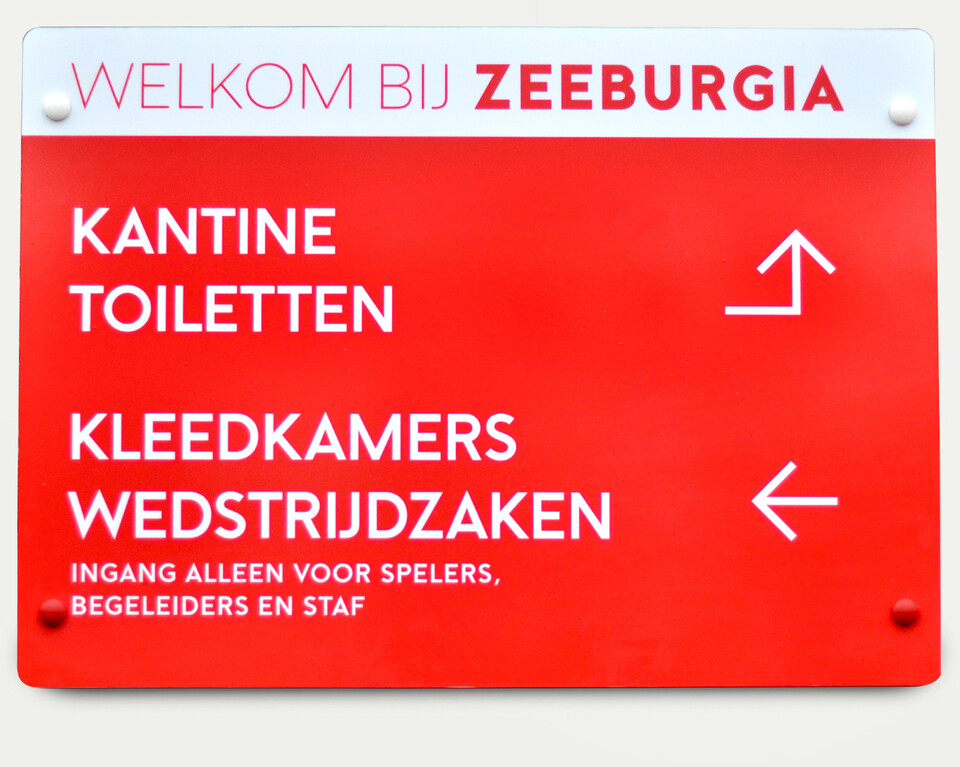
We help our own football club with graphic design. What started out as small contributions ended up as reorganizing the identity including the club's logo. A simple Z (that was used in the 1950's) seemed to be a clear and more forward looking identity that fits the motion of the club, being a youth academy for the professional leagues of Holland.
We still play in the lower Saturday teams of the club and we like it. Our team (also known as 2AT3RD4G) is proud the entire club is now wearing our Z as well as participating in letting the club grow, introducing partners like ING and Nike and recruiting more teams. The current succes has let us to adjusting our team name, this season we're named Zaterdag 6. Working on it.

